Remoteer >>>
Revolutionary remote job board listing site.
The site allows people to find work from home only positions to suit their career goals in a matter of minutes.
Check out the high fidelity
prototype of the project >>>
Client.
Course - Personal Project.
My Role.
Prepared and carried out research in the form of usability task based tests, questionnaires, generated user personas, conducted competitor analysis, journey mapping, story boards, mind mapping, and created qualitative surveys.
I will be creating all the wire frames, site maps, logos, selecting all the images, designing all website layouts, graphics, and generating clickable prototypes through Figma.
PROCESS >>>
The Problem.
How can users find remote jobs efficiently?
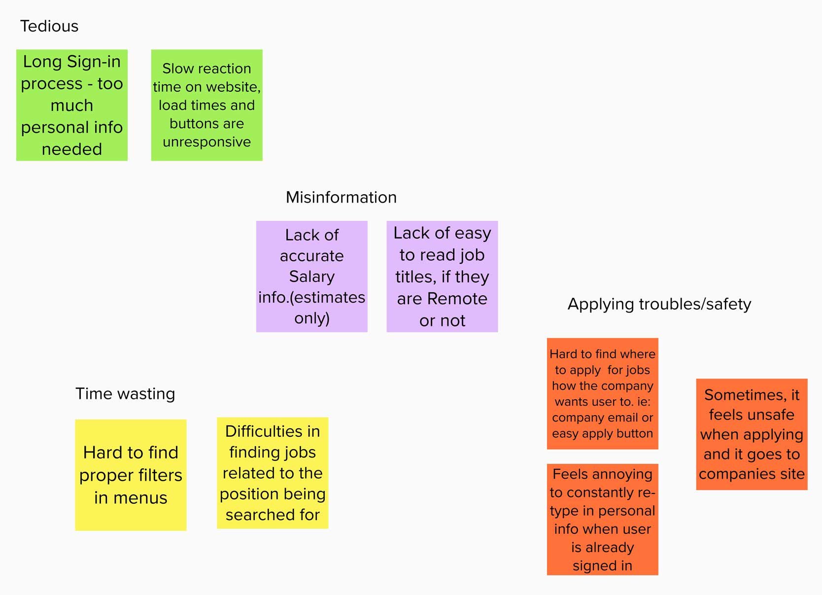
Users are tired of wasting time searching multiple job board ad sites.
They are stuck reading the ad over and over to find out if it’s remote or not.
Having to sign-on to a website and give personal information away to just view jobs.
Hard to navigate menus .
Keywords unable to pull correct job ads.
Users feel unsafe when unexpectedly taken to a different website.
THE METHOD.
Investigate other websites using competitor analysis methods as the quickest way to generate ideas, complete user testing and think of valuable one click flows.
Drill down to the root of the problem(s) with users on competitor sites by conducting usability testing, and multiple surveys.
After creating journey mapping and flows, begin to plan out the next steps.
Created wire frames and a/b testing over the course of several weeks.
Presented prototypes every step of the way to ensure a clear path was laid out.
Finalized UI elements and generated a high fidelity prototype, iterating every step of the process.
THE SOLUTION.
A new website that showcases remote only job ads.
It will combine all the great features of competitor sites into one amazing product.
New job ads can be posted directly to the website, but it will also pull relevant jobs ads from other job board sites.
ABOUT THE PROJECT >>>
Remoteer is a remote only job board site, that allows users to spend less time checking multiple sites. New job postings can be created and relevant job listings are pulled from competitor sites. Find jobs that fit any career path and allow users to work from home is now an easy task!
PRIME FUNCTIONS.
Save users valuable job searching time.
Efficiently formatted ads to find important information in the ad preview and titles.
Access to job listings without having to sign in.
Simple menu systems with important tabs featured first.
Excellent search bar able to pull concise ads with keywords.
Ample warning to user before they are taken off the website.
RESEARCH >>>
USERS INTERVIEWED.
Targeted audience was users that had looked for work in the past year.
Half of the participants had never been on a job listing website before.
Ages 25-45 years old.
They wanted to find remote job opportunities.
Were curious about the job salaries the other competitors were offering.
Were interested in finding out more about company’s and reading reviews.
competitor analysis.
GLASSDOOR
This site frustrated me the most when I was job hunting and it was lacking great features.
It is a popular job board site that allows uses to check out company’s ratings and reviews, but only if you have left one first.
Jobs can be found easily and salary information is sometimes included in listings (but is optional).
Salary is inaccurate 80% of the time.Users are inundated with a long sign up process, and are forced to sign up to see listings.
Menu options are hidden.
Key information was missing from the job description and titles, a quick read was impossible.
Slow loading times. Users were likely to bounce off.
Research gathered in Spring 2021.
Glassdoor journey map
INDEED
Indeed is a top job board website that features easy menu selections.
Quick sign up process, using Google integration.
Shows all jobs applied for in the user profile.
Key information can be quickly read in the title and headers of listings.
Keywords entered into the search bar pull mostly accurate ads.
Users receive many useless emails after signing up and they are difficult to unsubscribe from.
The messaging center makes it “easy” to connect the company and user, but it fails to work 50% of the time.
No auto-fill in the application forms.
Research was conducted in Spring 2021.
Indeed journey map
USABILITY TASK FINDINGS.
Usability tasks performed were a mixture of scavenger hunts, self generated and guided self generated.
Users were easily able to identify that Glassdoor and Indeed were job board sites.
All users interviewed hated having to sign up to see job listings, wary of entering personal information such as their salary and current company.
Unable to find remote selection in the menu.
Remote jobs were hard to identify 4 out of 5 times, this information was sometimes hidden in the ad and not shown in the listing header.
Search functions generated inaccurate job descriptions unrelated to what was entered.
Participants liked when the salary information was shown in the ad. However, sometimes the wage was generated by site bots.
Users found it frustrating to figure out how to apply for a job. Sometimes this data was buried in the ad.
They felt unsafe when taken to the company site without warning.
All applicants were drawn to the apply now button for ease of use, but were confused by Company’s that requested alternate ways to apply in the ad.
AGILE PERSONA.
Decision making diagrams.
Diagrams created for the purpose of figuring out what changes should be made first.
What were the easiest and most cost effective.
Which ones have the greatest impact on the product for the best user experience.
SURVEYS.
Conducted multiple surveys over the course of 4-weeks to gain quantitative research.
Easiest method to gain research online.
Challenging as users might not participate because it takes over 10 minutes and requires multiple tasks to be completed.
SURVEY RESULTS.
Re-iterated that users do not sign up before seeing job listings.
Being taken away from the job board website to a new site without warning made users wary.
People need a large quantity of jobs to choose from.
They wanted to see job titles, headers with relevant information such as salary, language, listing date, remote, full-time or part-time role.
There should be a standard format for ads, for skimmability.
At this stage, users did not find application with resume auto-fill necessary.
STORYBOARD.
What the user will experience when finding Remoteer.
DIGGING DEEPER >>>
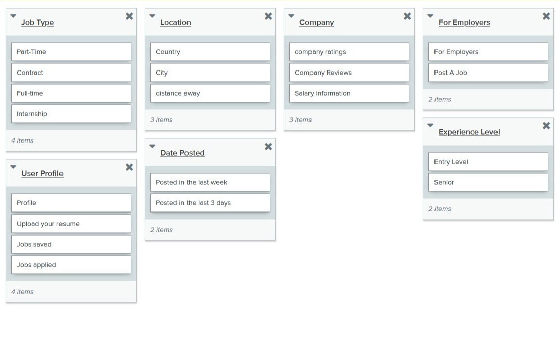
CARD SORTING.
I conducted an open card sorting test on 10 participants.
This was valuable information in creating menu flows and how users would access the information.
Overall the card sort was helpful, but some of the users found it difficult in openly naming the categories.
In future I plan to give users more direction and use the closed card sorting method, which will provide category names.
CUSTOMER JOURNEY MAP.
Generated to determine how the user will flow through the website and what pathways they possibly may take.
Opportunists were created such as streamlining paths.
Determined where the sign up/sign on feature should be activated.
MAIN USER FLOW.
SIGN UP FLOW.
FIND A JOB THROUGH THE COMPANY NAME FLOW.
CRAZY EIGHTS.
An 8 minute fun exercise to get some ideas flowing for possible page layouts.
Some of the silliest ideas could be the most brilliant.
WIREFRAMING >>>
ITERATION ONE AND TWO.
A/B Testing with in-person interviews and online survey combo.
Participants needed to be able to auto-fill application with information from their resume or pre-existing information.
Icons were well received but used sparingly.
Testing these flows in combination with varying styles I was able to narrow down my website scope.
Invest in neutral post-it notes…
Digital wireframing.
Visually these were a lot more compelling to the user
With the upgraded wire frames and interactions I was able to gather even more qualitative feedback.
UI DESIGN GUIDELINE >>>
PRIMARY COLORS.
Classic Blue - Pantone of the Year 2020.
Classic blue helps induce a gently calming effect and feeling of peaceful tranquility. Exudes trust and intelligence.
#14487f - Background main, text main, menu text and logo.
Light Grey
#f1f2f2 - Secondary backgrounds and drop shadows.
SECONDARY COLORS.
White
#ffffff - Text squares, highlights,
and menus.
Baby blue grey
#778690 - Secondary text.
HIGHLIGHT COLORS.
Peach quartz
#a5785b - Important text highlights.
Corn husk
#c0a57b - Logo initial.
LOGO.
A simple R initial to represent Remoteer’s
modern but classic overall look.
FONT.
Liberation Sans
Classic, modern and bold.
A contemporary twist on generic fonts like Arial and Helvetica.
FINAL PROTOTYPE >>>
Check out a video explaining the prototype and its features here.


