SASKATOON CYCLONES >>>
The brief -
This Saskatoon Cyclones logo was generated for a post interview assignment for a local sports clothing Company.
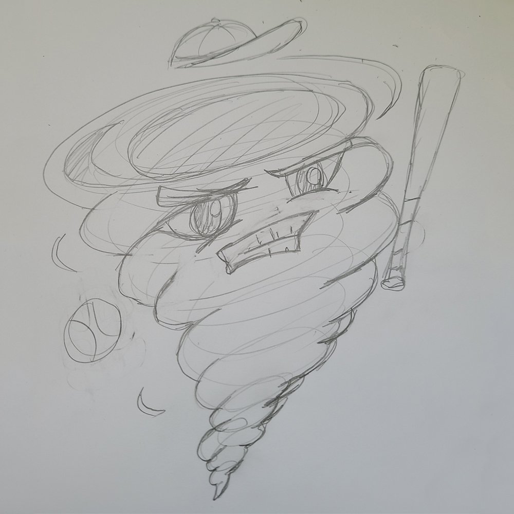
I was inspired by cyclones with faces, from the web. I went with a more friendly yet serious look for the logo, perhaps for a kids, teens or even fun adult team.
This logo is for screen printed clothing, so the thick lines not only add flare but also allows the ink to seep into the lines nicer as well.
- 2021
Inspiration & Ideas >>>
SKETCHES and variations >>>
The sketch of the logo was very important this time around, to help me discover the movement of the piece and flow for the facial features.
This grey-blue color was chosen based on other baseball logos branding. Blue is a surprisingly popular choice among teams. The fonts I chose are “generic” and “safe” sport styles. A bold uppercase font for a adults or a more whimsical bubble shape for kids.


